Soak Up the View
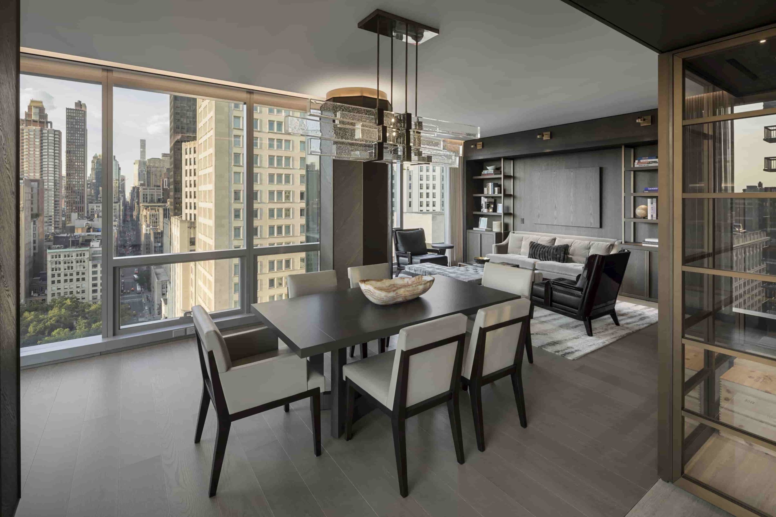
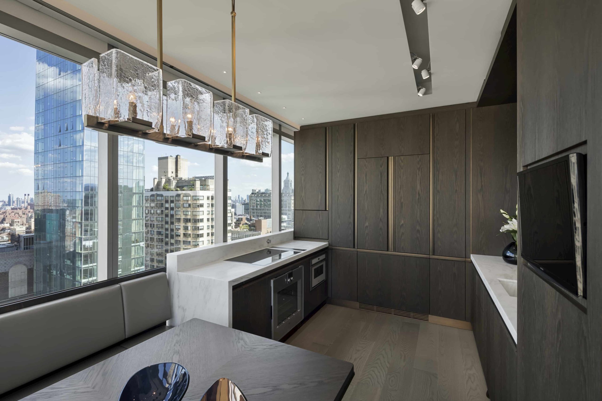
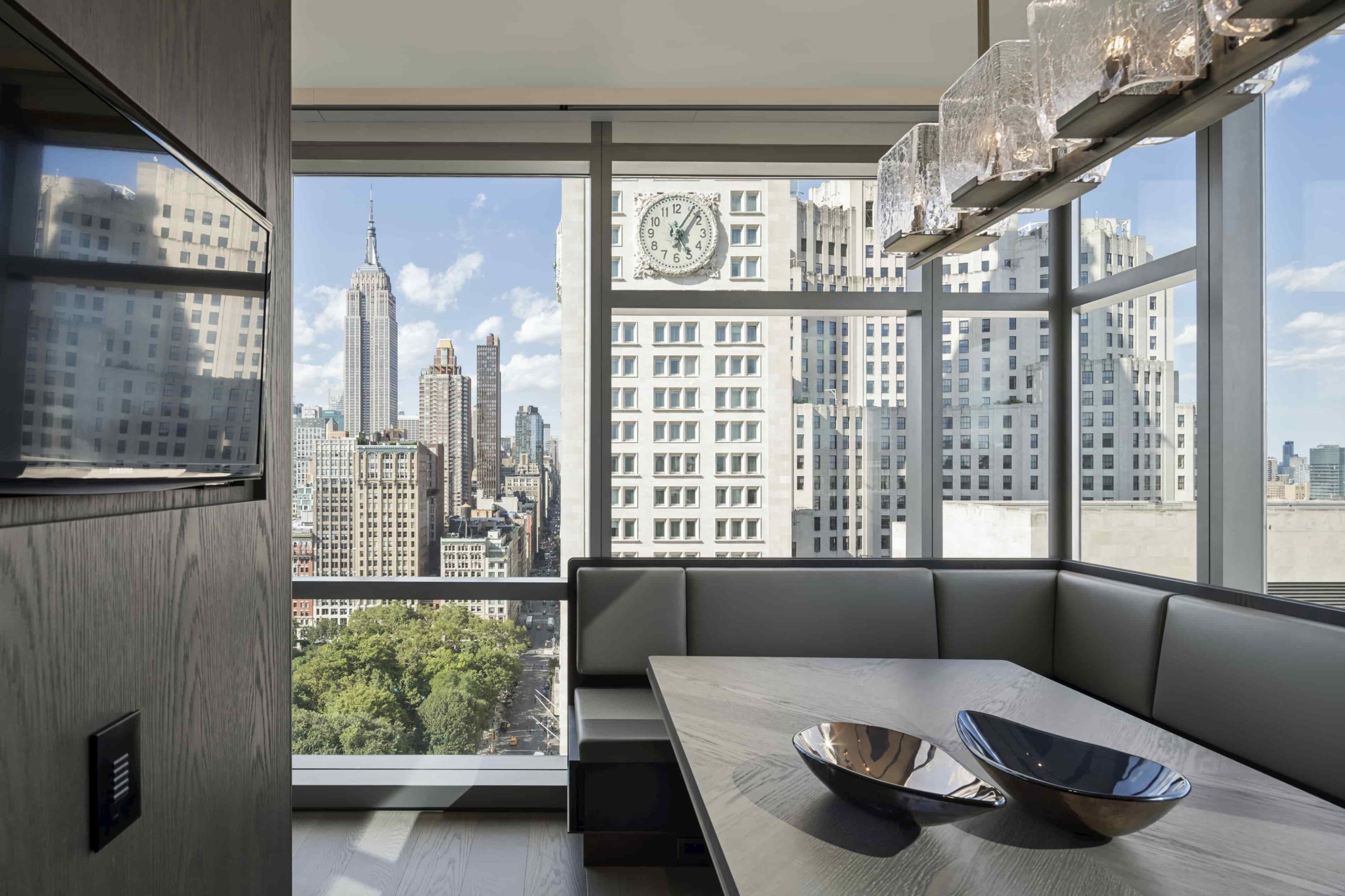
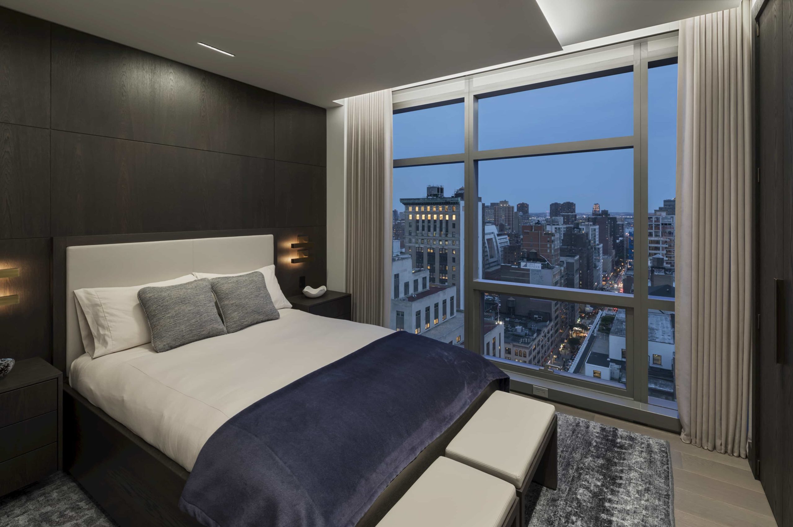
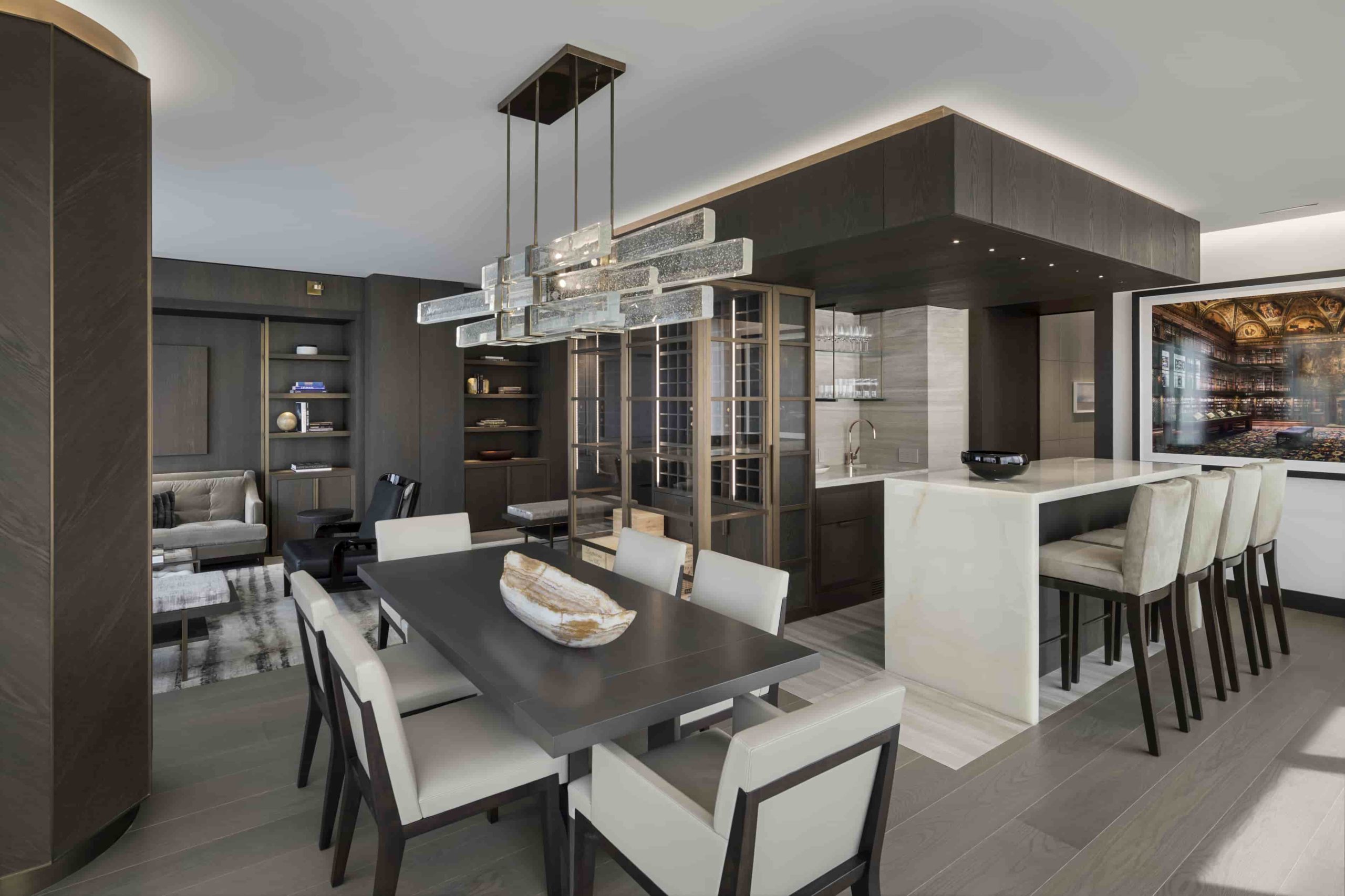
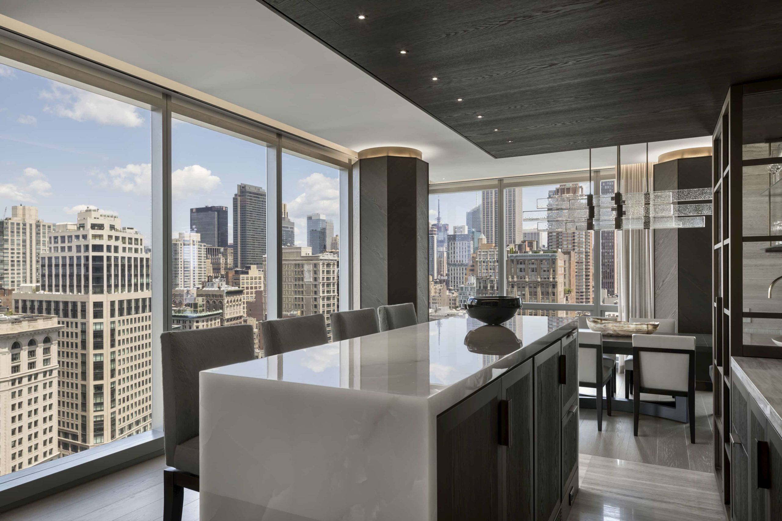
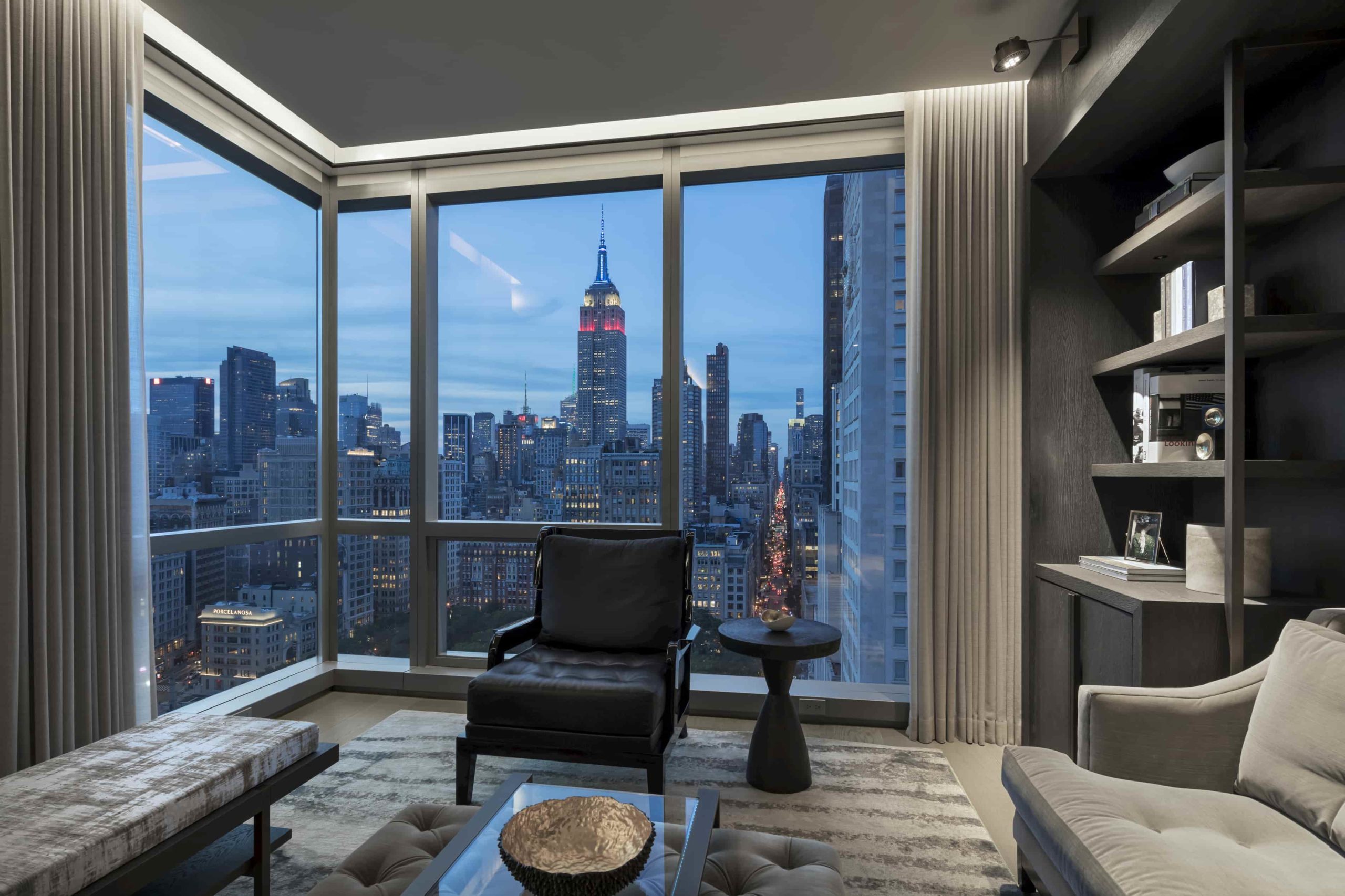
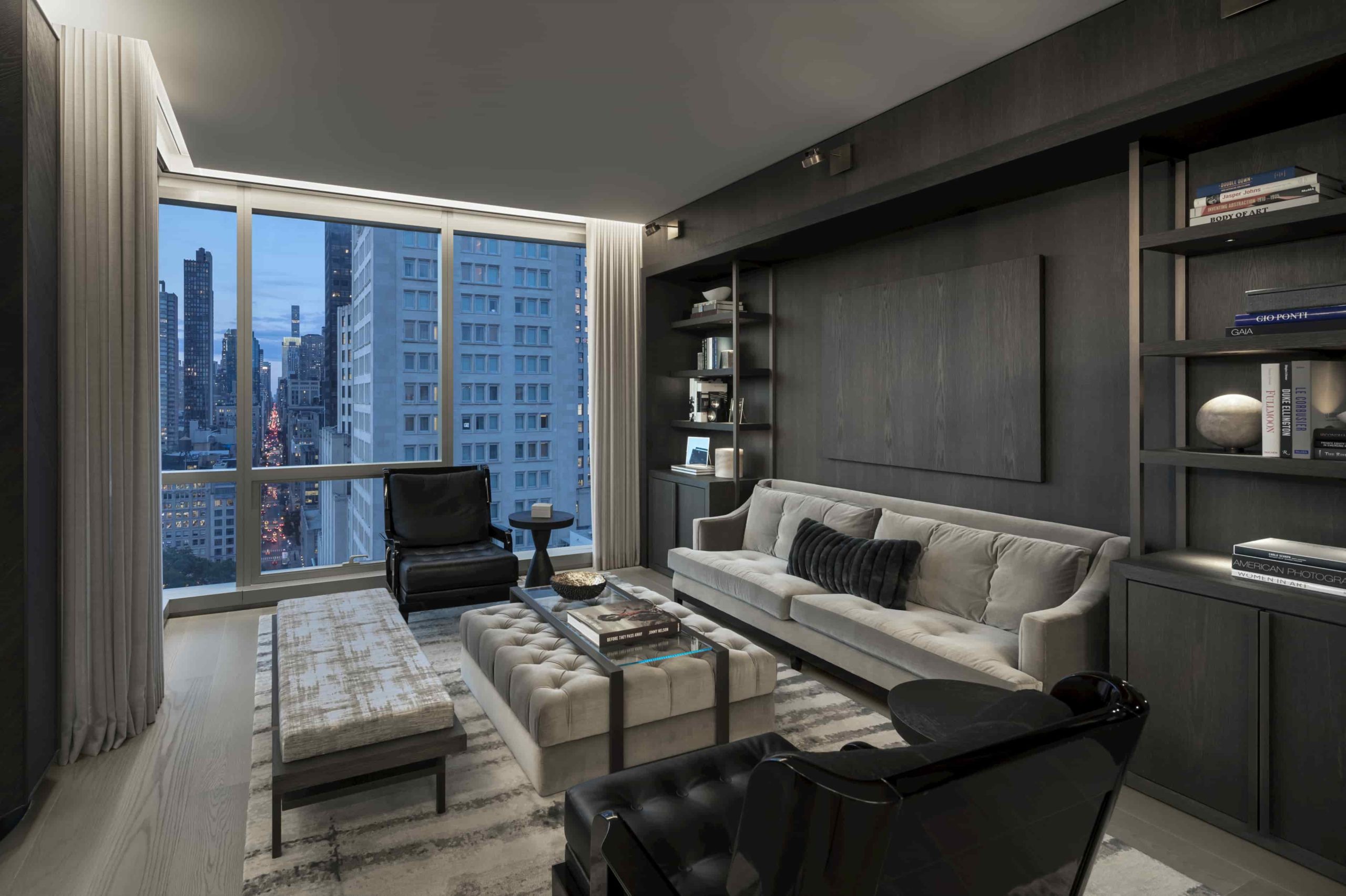
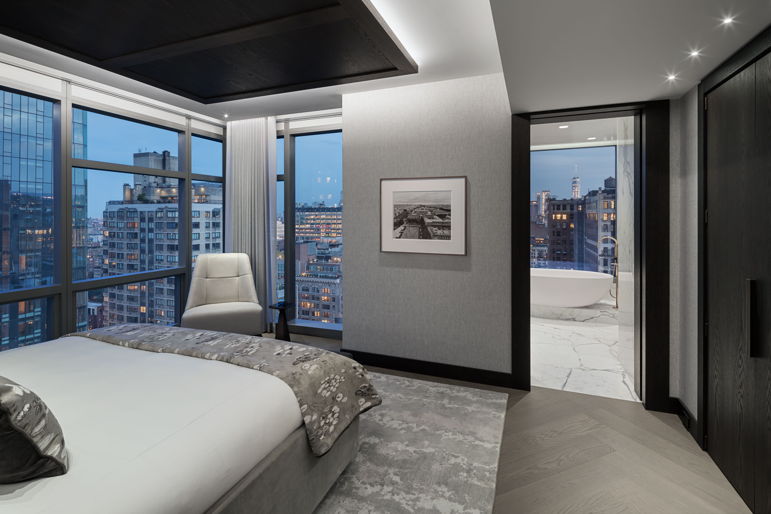
The client bought two adjoining apartments in a tall needle building so that he could have full 360-degree views.
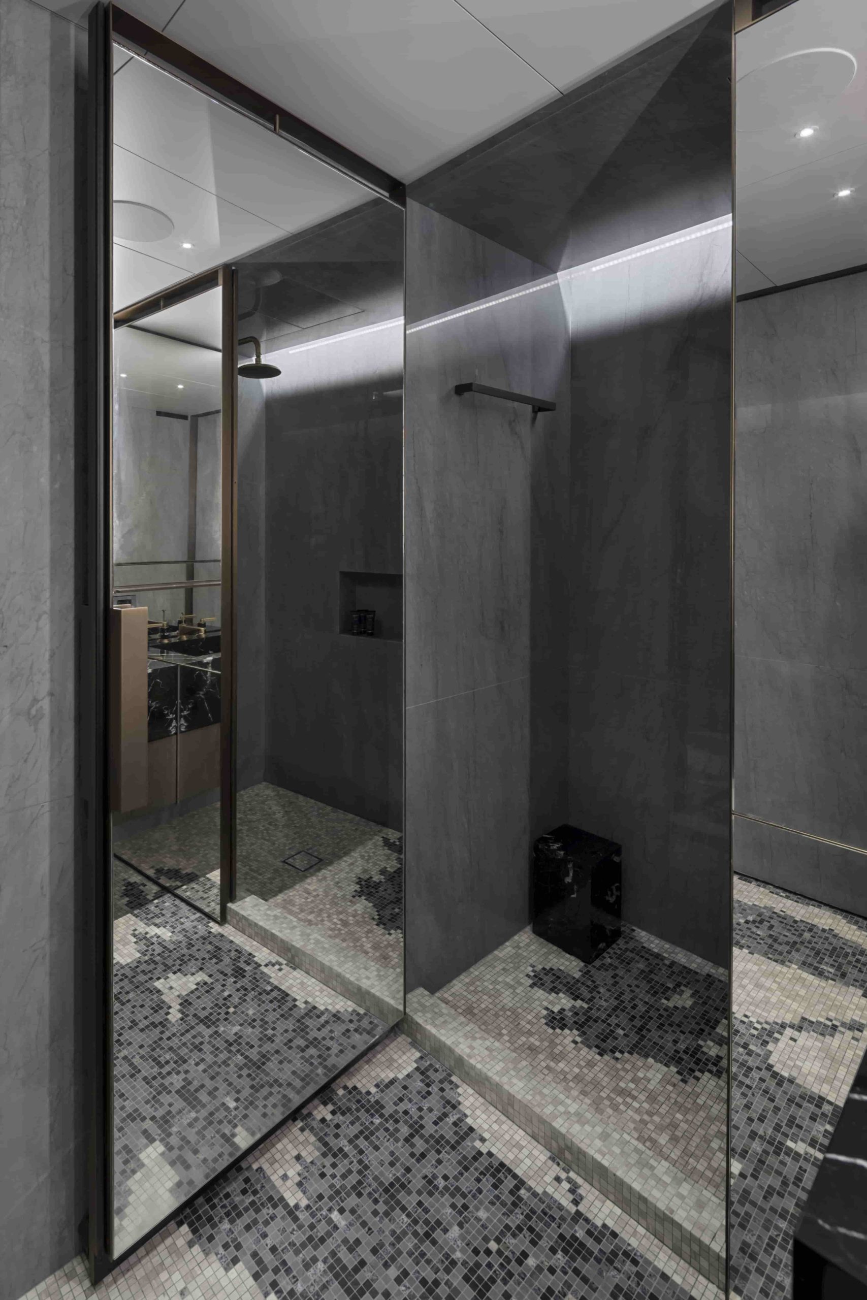
While the building is architecturally significant, the apartments as constructed were frugal and poorly conceived. With simple sheetrock finishes, the bathroom had a dark alcove shower which blocked much of the view and the mirror floating over the vanity blocked the rest.
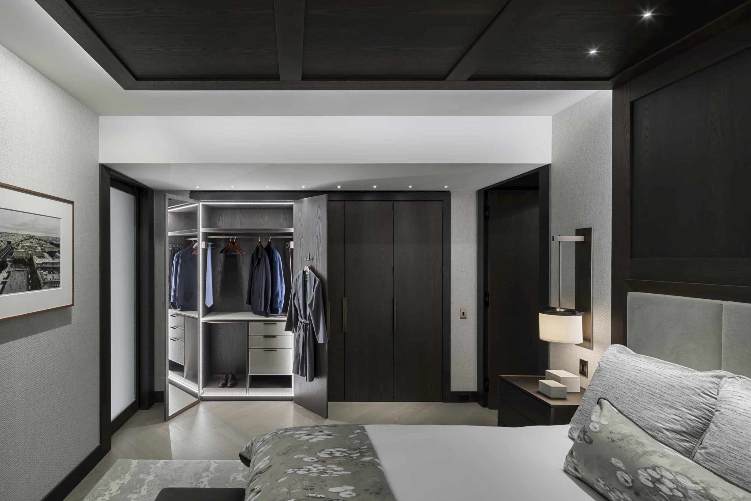
The client is a political consultant and was looking for a magical pied-a-terre in New York; which would serve as a personal home base for his many trips, as well as a locale for grand entertaining. Bringing the views into the apartment was key. The architectural firm of PlainSpace and the interior designer, Shari Pellows set the work.
Time was of the essence on the project. The initial renovation began but was destroyed by over 19 feet of standing water during Hurricane Sandy. The property is a block from the Hudson River and has two levels below grade. Following Sandy, the house was again stripped and the construction, once begun, was completed in ten months, just in time for the arrival of the couple’s first child.
This panoramic view shows the solid shower, the mirror in front of the window and the tight view over the tub.
Architecture: Plainspace Architecture and Design
Photography: Paul Rivera Architectural Photography
Interior Designer: Shari Pellows Interiors
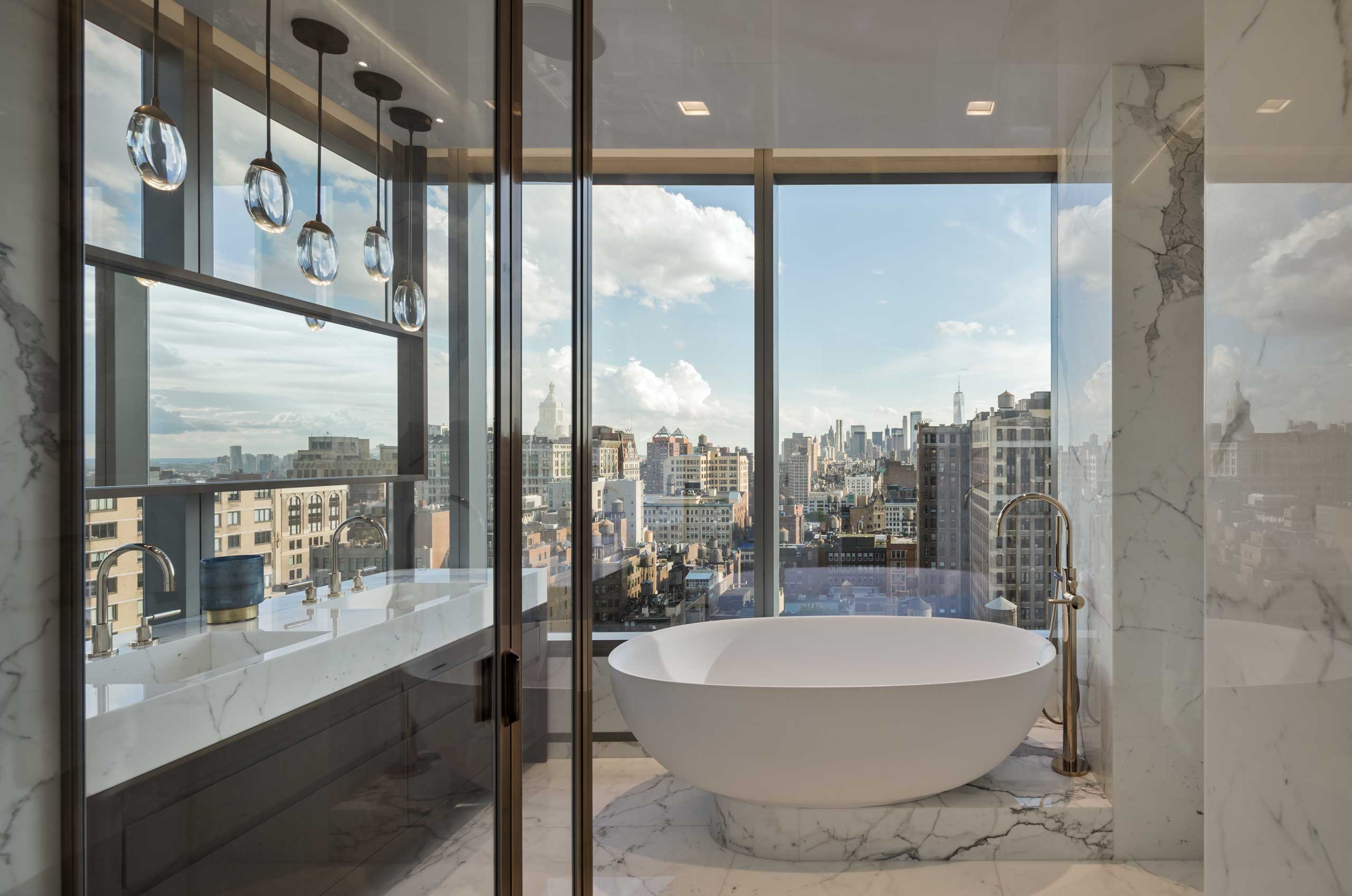
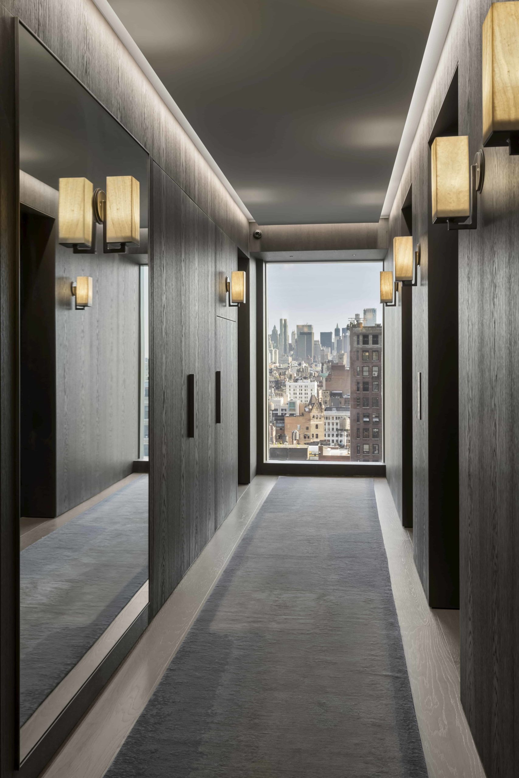
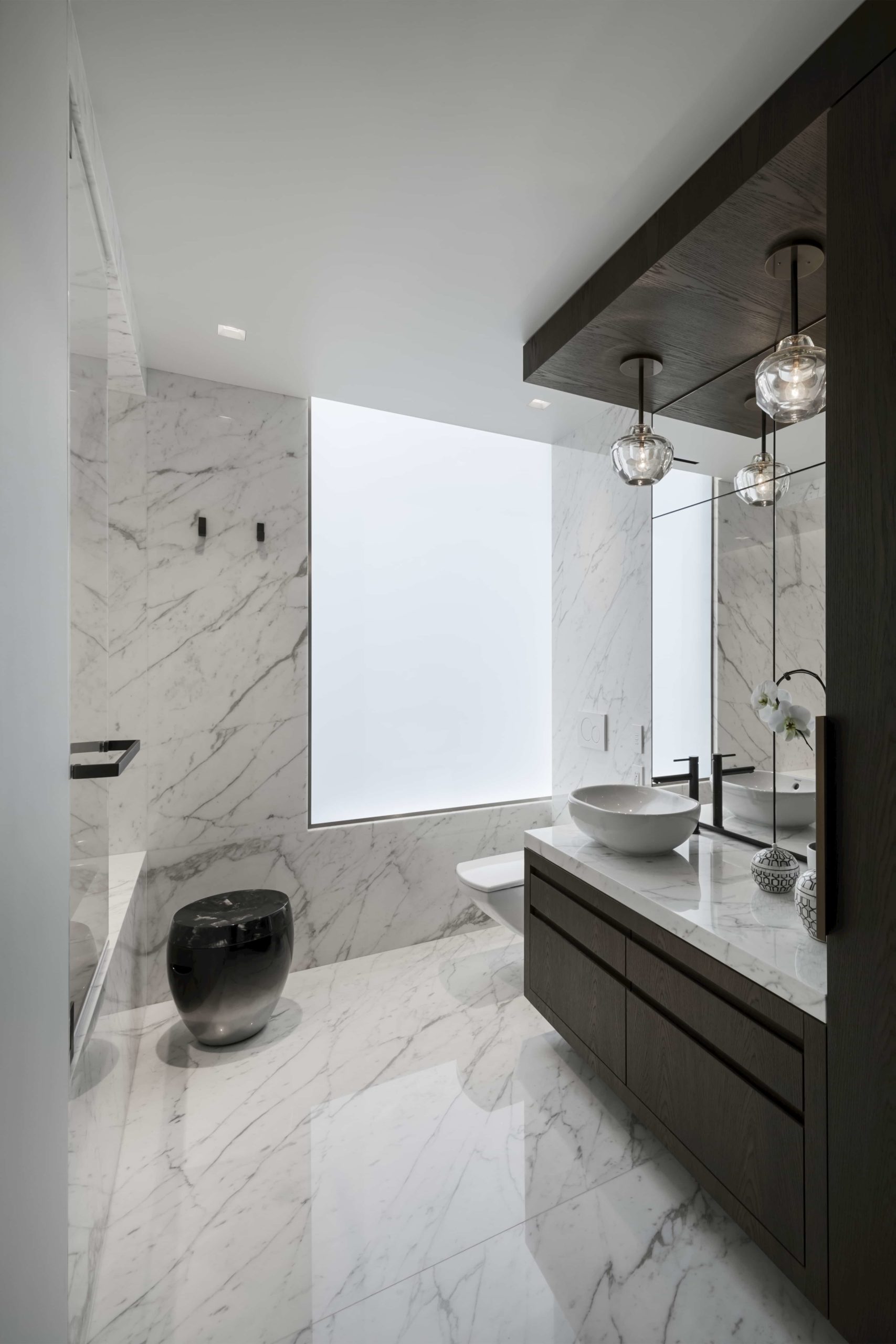
As built, the views are wide open and exceptional.
The original shower wall had the building’s vent riser and a water line going floor to ceiling. Had it been a waste riser, it would have been impossible to relocate; but vent lines are nothing but air, so the pipe was offset sideways along with he water riser and hidden in a tall and wide shower curb.
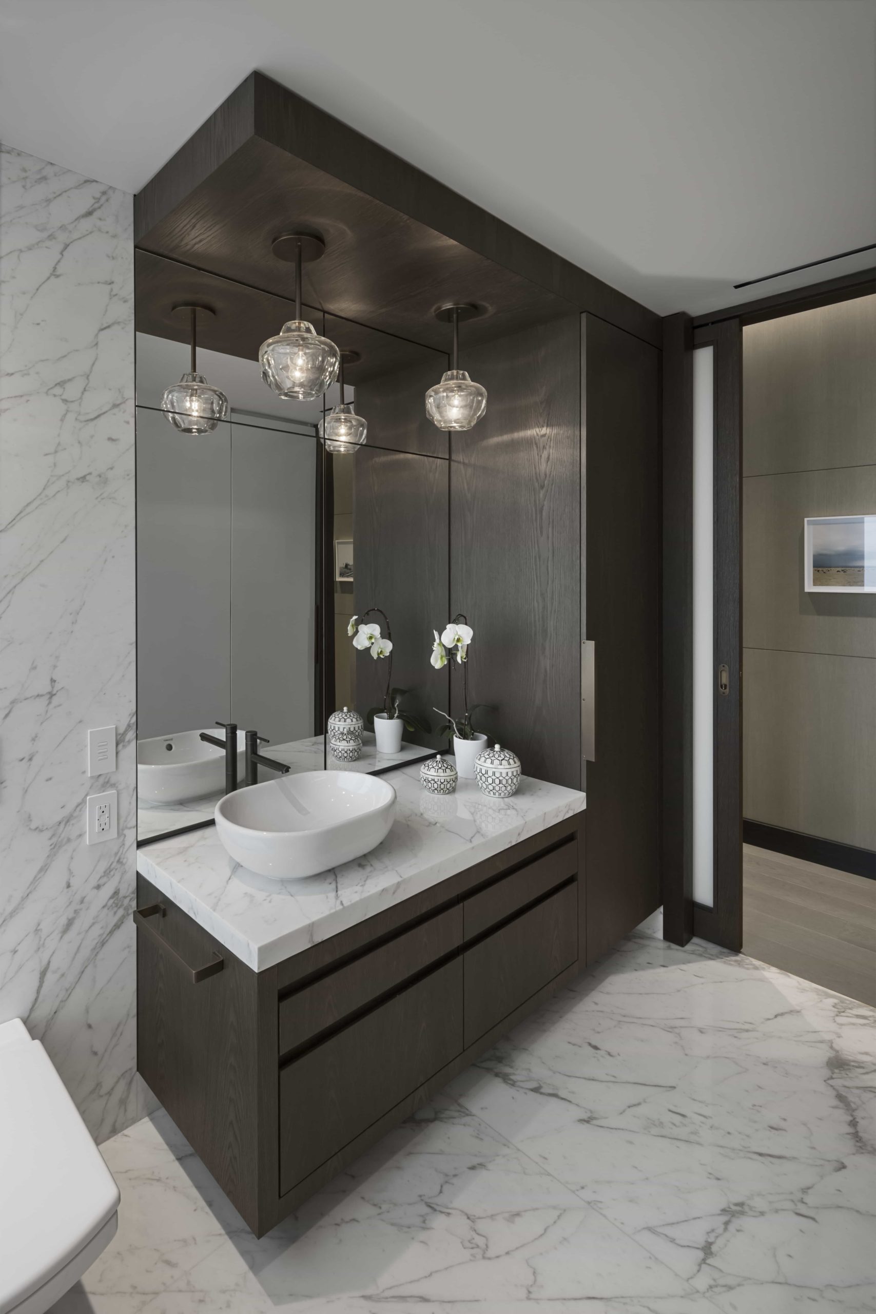
At the location of the old double sink vanity, there was no drain line in the floor. The neighbor was not willing to allow us to open their ceiling to make the connection be- low, so we build an attractive stone platform and ran the piping sideways to connect to the building’s waste riser to the right of the tub. The platform improved the view looking down into the city.
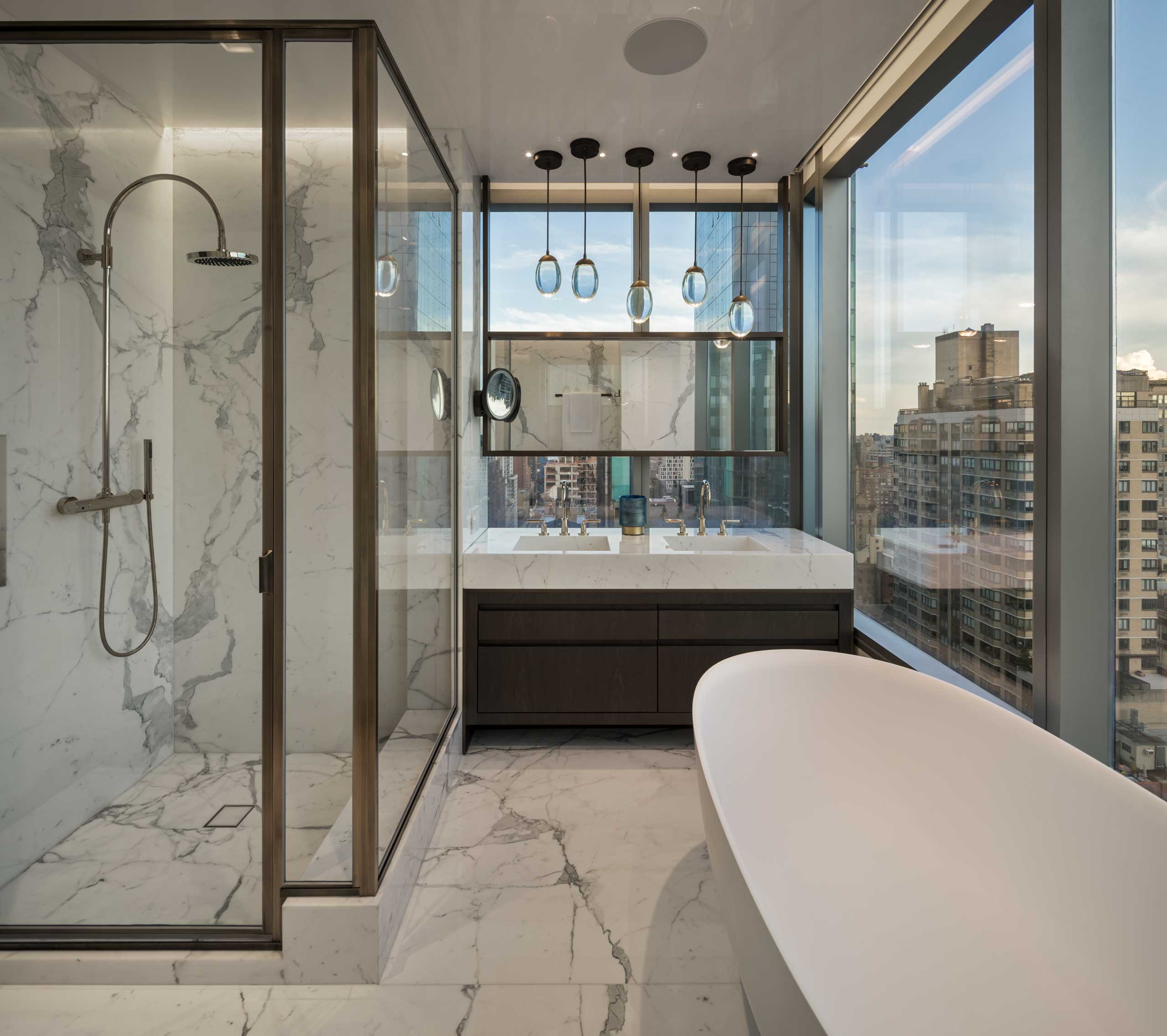
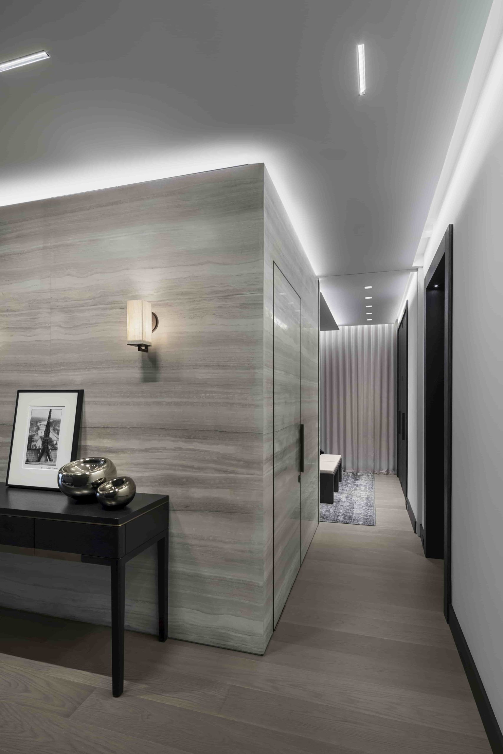
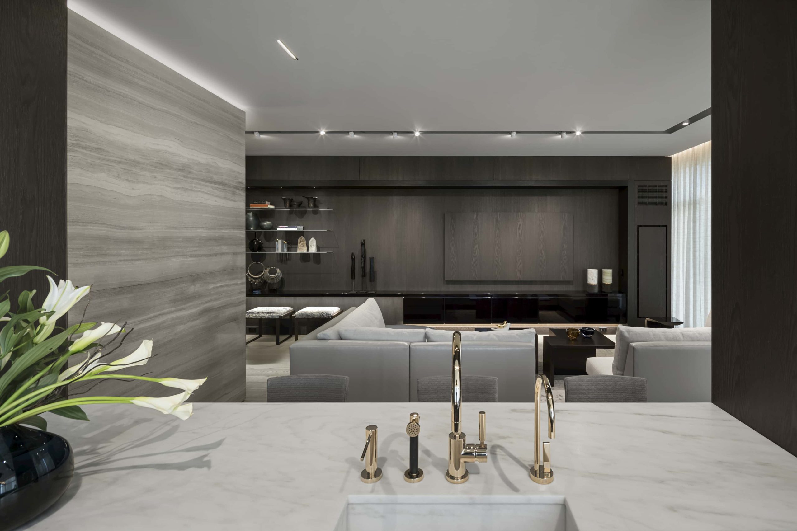
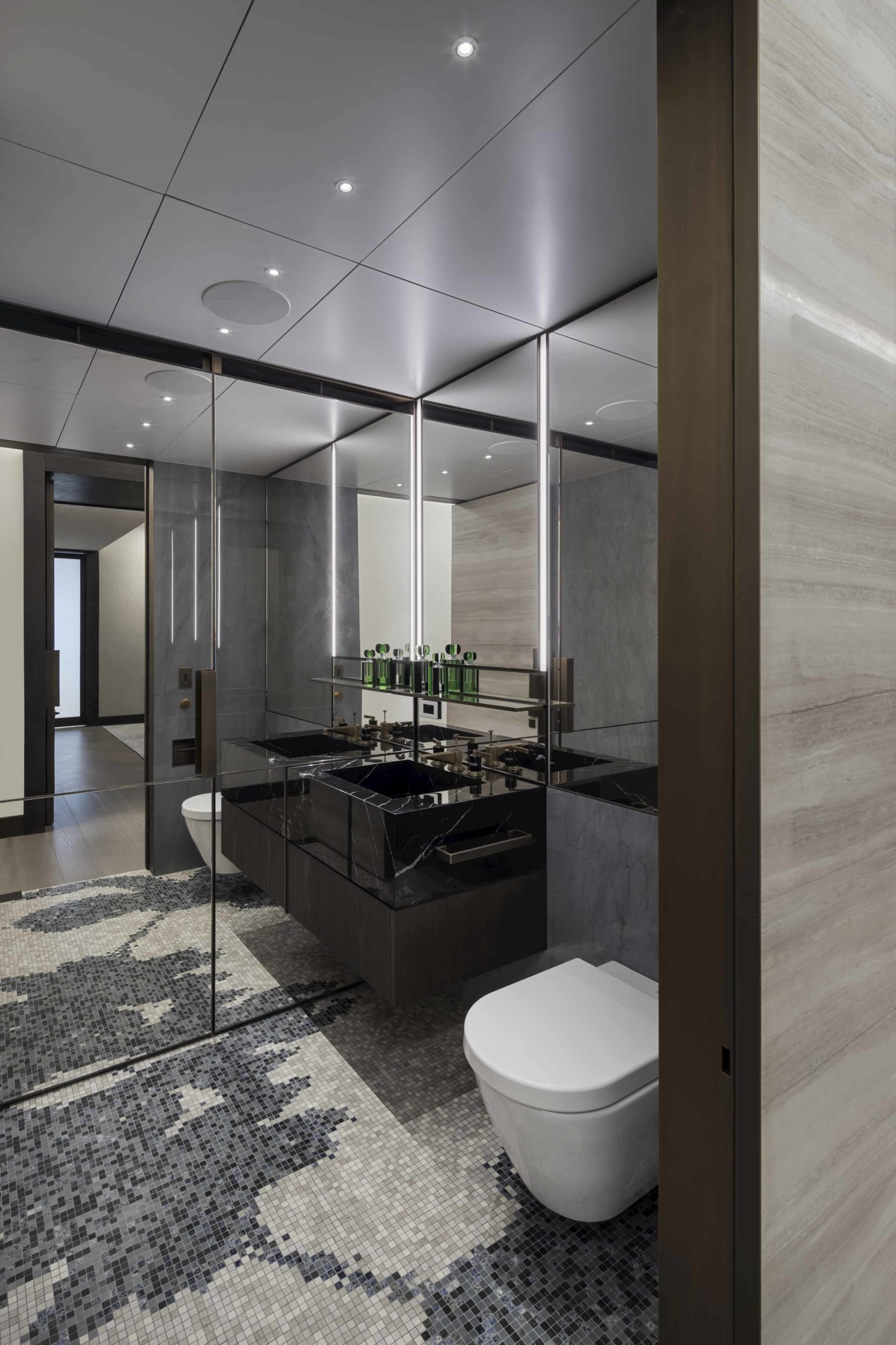
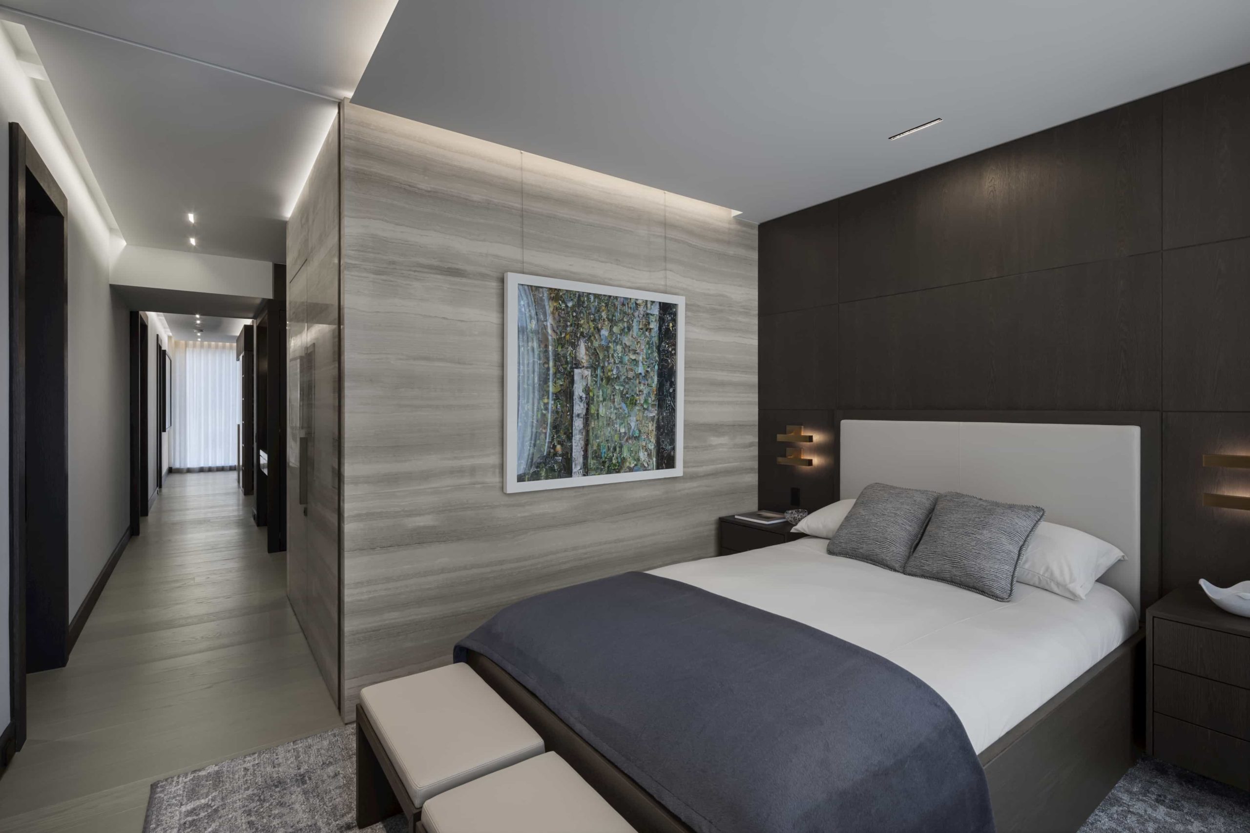
The design team used stone to create many of the wall finishes in the apartment. The bathroom stone was highly figured and so it was important to match up the stone veining so that it looked intentional and beautiful. Using photographs of the stones themselves to achieve matches, the veining was carefully aligned in photos.
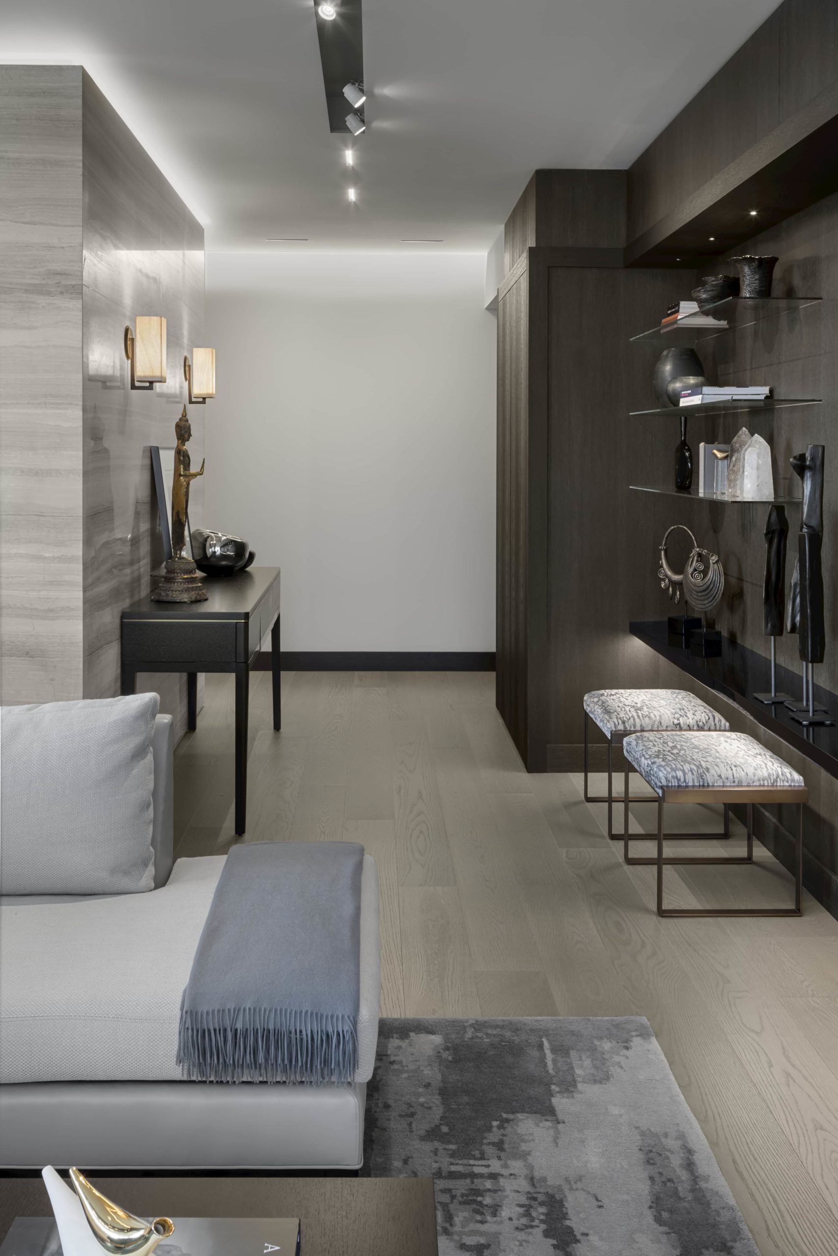
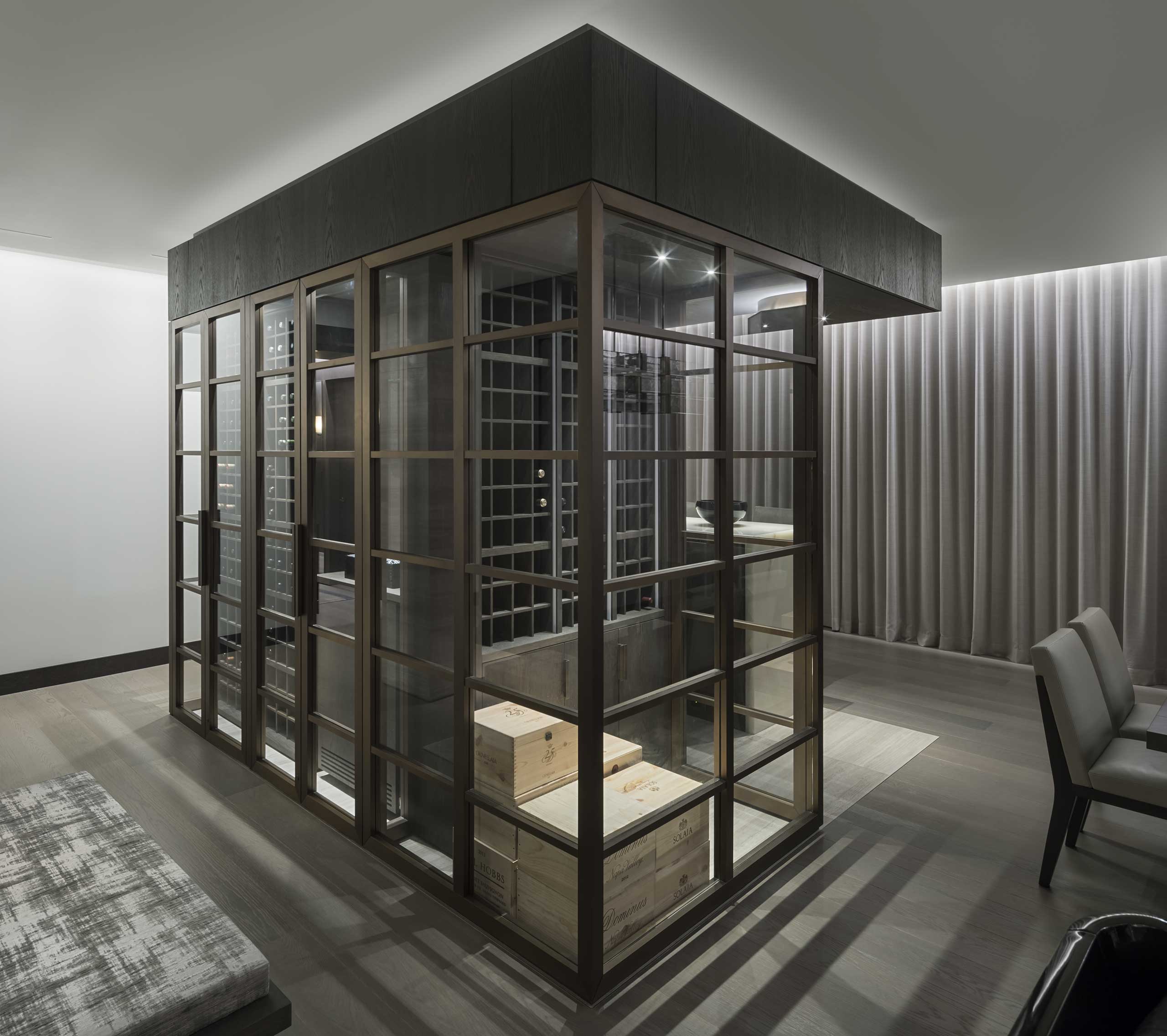
With walls throughout the apartment clad in horizontally matched stone; a large, custom built, free standing wine room; this is an apartment where cost was important, but not a restriction.
The client wrote: “We remain tremendously pleased with the design and the quality of workmanship, but also just the wonderful way we’ve been able to live in the space and experience our home and the city in such extraordinary manner.”
When you are this high over the city, the slender mirror is adequate.
Height creates its own privacy… But this is an apartment to immerse oneself in the city.

